Today, I’ll be exploring streamlit, a new tool that makes making interactive data apps especially easy. To do so, we’ll be using this dataset (Table 1) of PhDs awarded in the US from 1958-2017.
I began by doing some basic data cleaning and exploration, which you can see here. Next, let’s build a quick dashboard!
Note. The code to make this dashboard is
1. Create baseline app
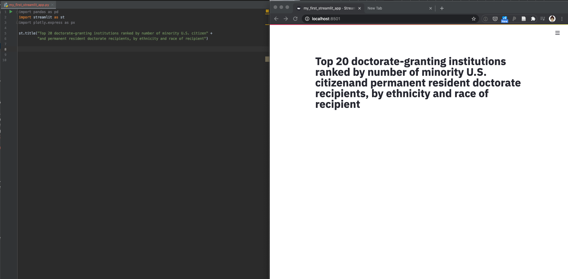
First, we’ll set up the shell of the app; what’s important is to import streamlit at the top of the file. You can run the app like this, but I also added a title as shown below.
Then, you can run the app like any other Python script by typing streamlit run my_first_streamlit_app.py. On the command line a browser link will appear, which you can click to see the app as it currently is:
2. Load (& provide the option to display) data
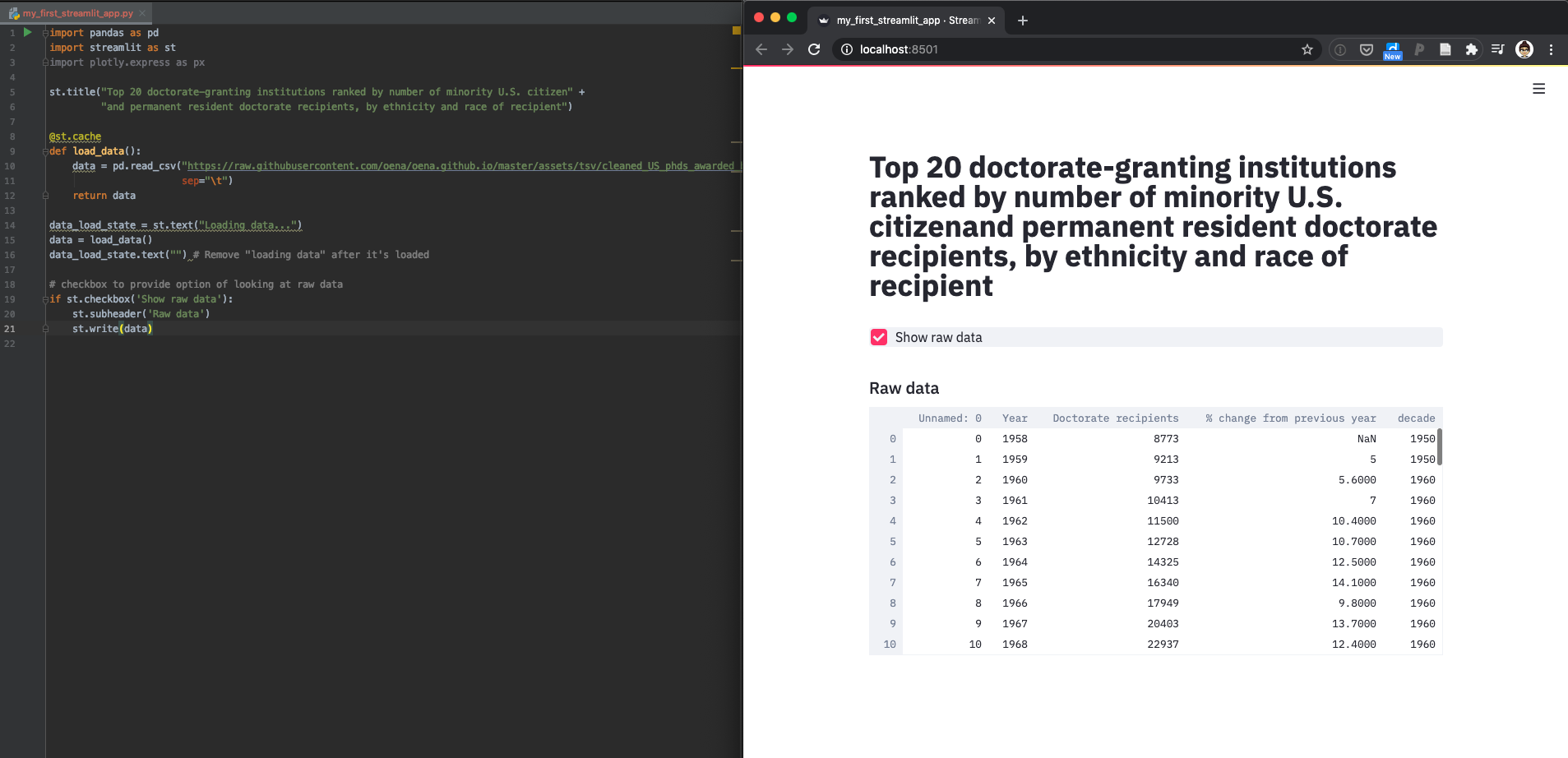
It’s not strictly necessary for this simple of an app, but to follow the style suggestions on the streamlit website we’ll write a function to load the data. Around the function, we also add two text elements indicating that the data is loading (that then goes away once it’s done). Because loading data can take a while and we don’t want to do it unnecessarily, we add a decorator @st.cache above the load_data() function to memoize the dataset (more details on this here).
If you run this as is, nothing will change in the displayed browser. So, let’s also add our first button! We add a checkbox that displays the data (using st.write(data)) if it’s selected.
You can see both these steps and the displayed output below:
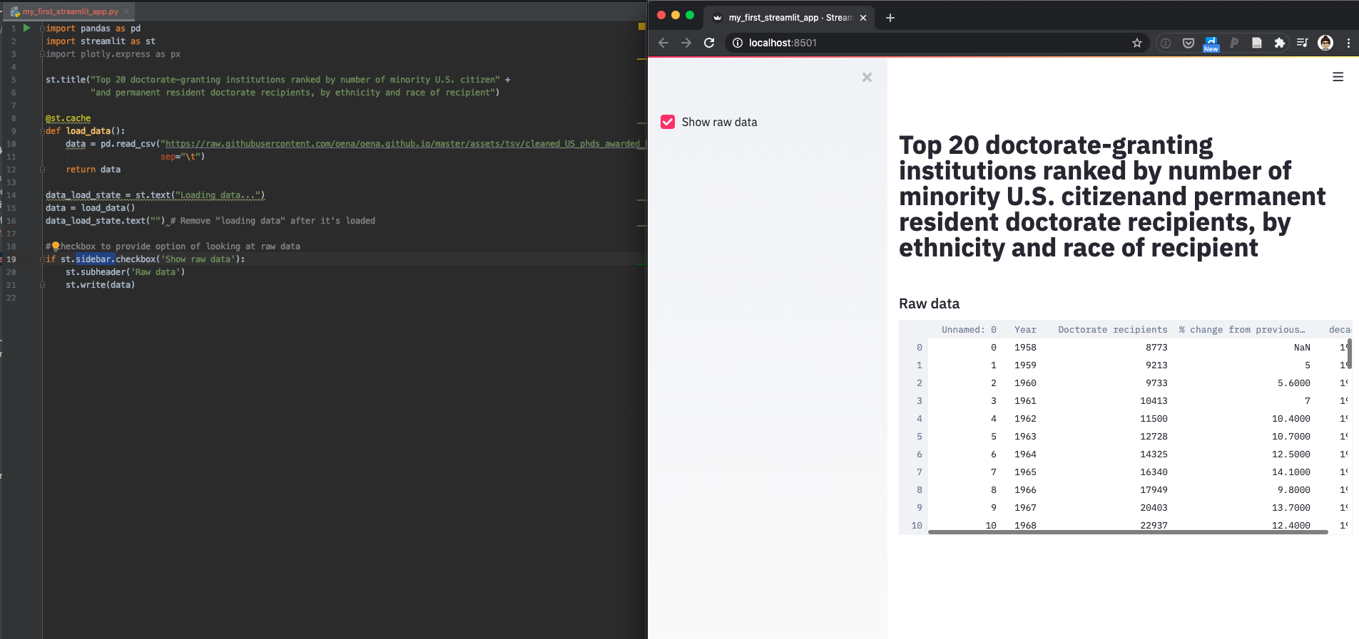
3. Move checkbox to sidebar
It’s nice to have buttons and sliders all in one place (in a sidebar), so let’s do that for the checkbox to display raw data. This is super easy– just modify st.checkbox() to st.sidebar.checkbox() as follows:
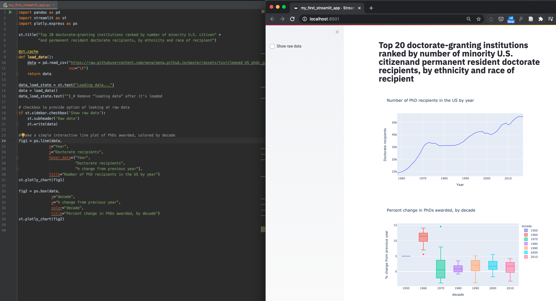
4. Add some plotly plots
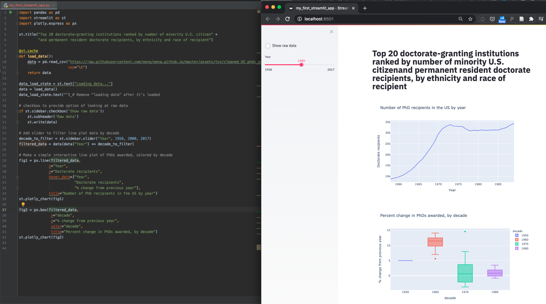
Next, let’s add two interactive plotly plots; to start, we’ll use the whole dataset to do this.
The top plot shows PhD’s awarded by year, and the bottom shows percent variability by decade (it’s interesting that the 1960’s was such a variable time in PhD’s awarded!). Here’s the code to do this:
5. Add a slider to filter both plots simultaneously
Lastly, let’s add a slider to filter the results displayed; a nice part of streamlit is that this is super easy to do.
Just add another slider to the sidebar:
And that’s it! In only 42 lines of code, we have a beautiful and functional dashboard.